— Letters 05 / 05
Double Rainbow: Our Relationships with Color at Work and Play
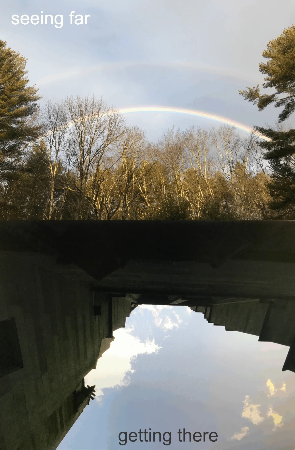
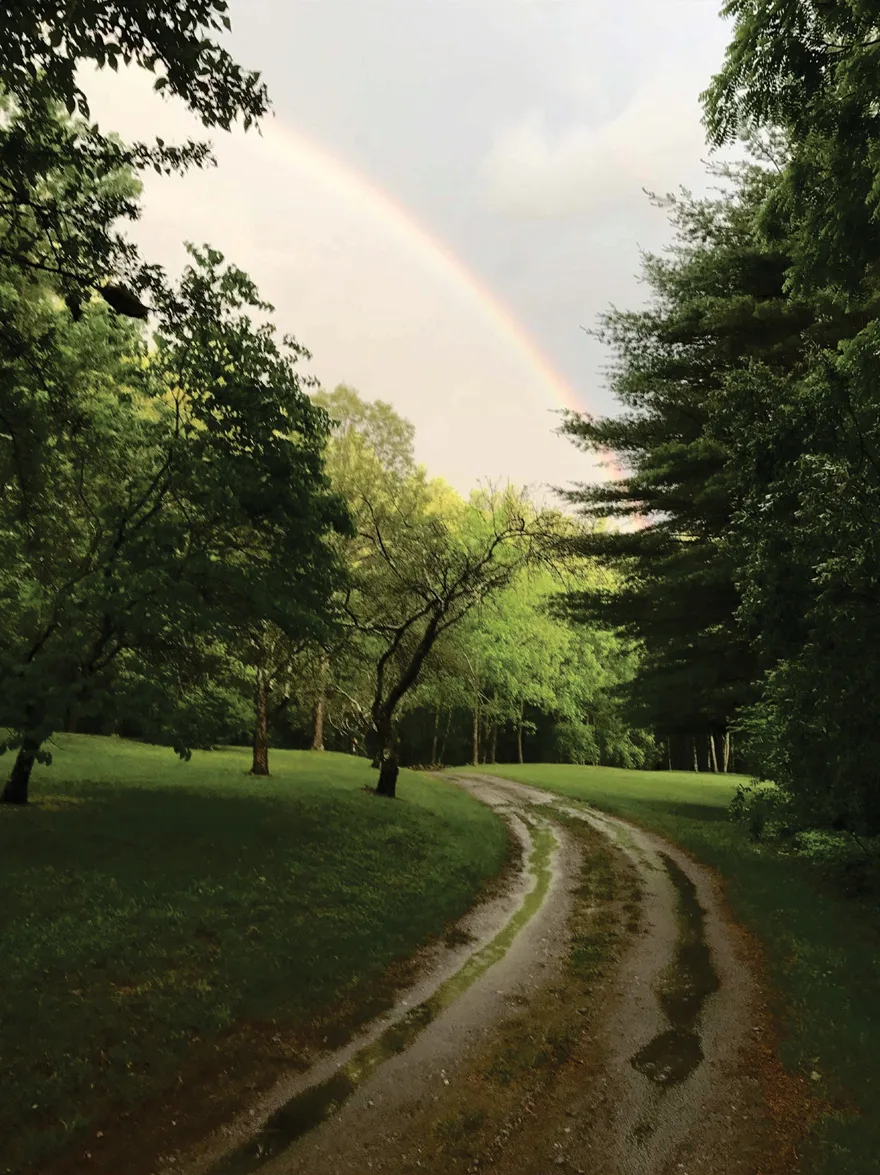
It was Chinese New Years Day, around 7 a.m., I saw a double rainbow. The outer one was hazy while the inner colors shined brightly among the pine trees…
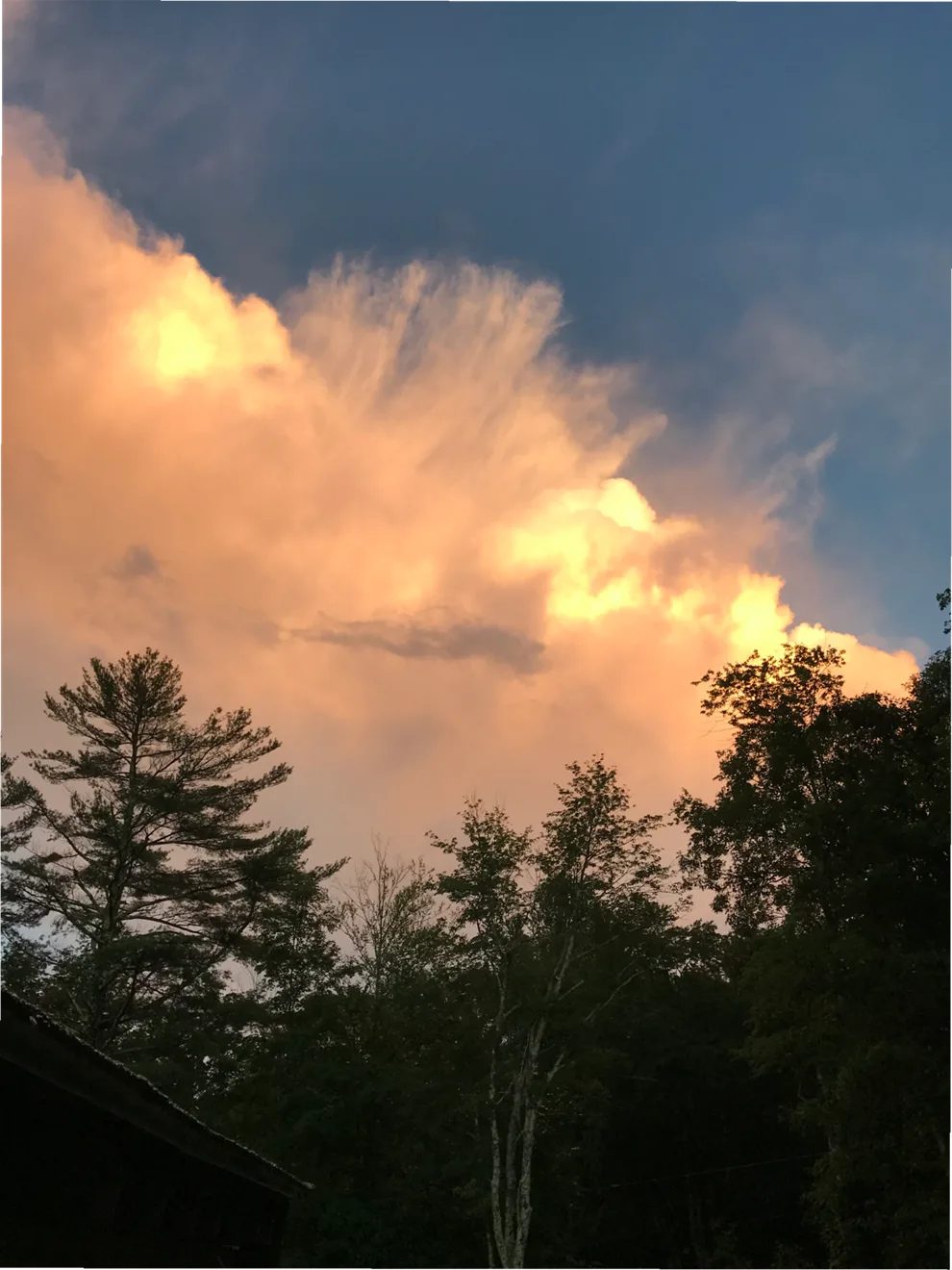
It was Chinese New Years Day, around 7 a.m., I saw a double rainbow. The outer one was hazy while the inner colors shined brightly among the pine trees… a fleeting vision, which lasted ninety seconds, but it made the day.
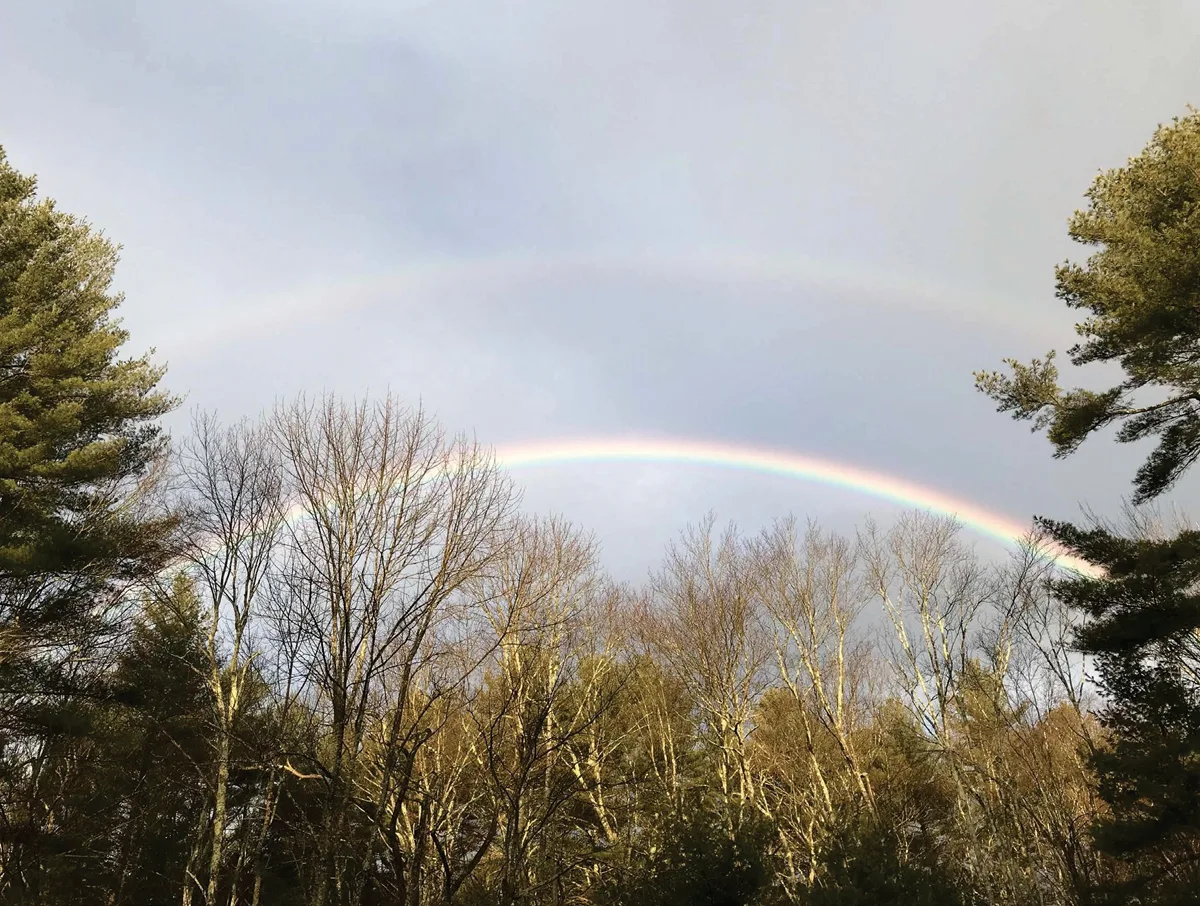
Rainbows change, each unique as come and go, similar to our tastes and preferences that can change just as quickly.
Universal connections in color and nature
Ancient cultures gravitated toward certain colors because of their connection to natural phenomena. Color demonstrates vitality. Monuments were built in homage and celebration to deities or driving forces: time, function and energy as seen in the sun, moon and their seasons. Traces of color in the finishes are still at work in Mayan temples showing reverence to the Gods. In Mexican churches, yellow is an often used association of fertility. In Chinese traditions, colors are symbolic indications of belief and health, red being associated with fire, happiness and well-being, green with flexibility and growth.
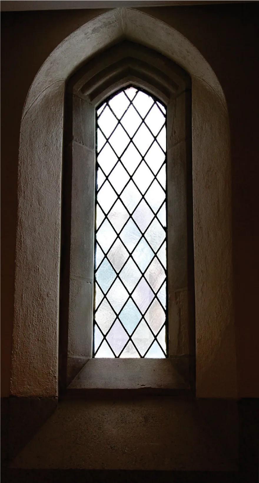
During the Reformation, many ornaments and decorative elements were removed from Roman churches and cathedrals, we see their exteriors as somber and colorless, except for the stained glass openings that celebrate light in the cold stone spatial volumes. Inspirationally responding to the moments each day, these architectural monuments quietly speak volumes through generations.
Relativity of color in our experience
The experience of color continues to change and develop through different means as well. Until my teenage years, I only saw black and white television. Technological advances can change our perceptions in subtleties and it’s important to note how a person’s experience is influential in preference and use. It’s a process; from childhood to adulthood. Ask a child her favorite color — Blue! Give her a box of crayons and she’ll draw a sunset. Yet, look at an October sunset and compare it with an April sunset, how are they different?
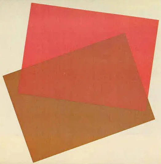
It would be an interesting class assignment to draw the colors of a sunset each month, observing the differences in brightness, the various hues, tints and shades. How do they work together, why? Does a child’s smartphone show anything similar? The real colors in Nature, have taught us to observe carefully; ‘red sky at night, sailor’s delight.’
When I meet with clients, we explore color possibilities with their tastes and interests, which is best? We have to present options, narrow them down; how will this make you feel?, why? What difference will this option make? The steps that follow are the work, it requires trial and error. It’s important here to work on site, not abstractly in an office, but apply large scale samples on the surfaces themselves. Simply, color is influenced by its environs, and the given results elevate one’s senses and sensibilities within that setting and beyond.
Color’s presence in formative processes
As I consider the lightness or darkness of colors in our external and internal worlds, I’m taken back to my own childhood. My family moved into a different house… my bedroom was pink. I wasn’t spared the inevitable teasing from my brothers I had to endure. Perhaps it was luck, that color’s influence likely enhanced my spatial and creative juices that followed.
A few years later, we painted it over with a neutral choice, probably better for a teen…but the vivid pink plays on, I can still feel its influence today.
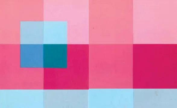
Clients with families can seize the chance to apply color as an influential element in a child’s formative years, environmentally enhancing the growth experience. Should this process have to end as we age? Perhaps someone who is in the Winter of their years would benefit from the colors of an April sunset.
There is nuance and subtlety of an open-ended process, like an oil painting, there’s always the chance — or opportunity, to make something flourish.
Color’s relationship to function in architecture
Color blends or contrasts in its settings, as illustrated by the Golden Gate Bridge, which refers to the Gold Rush of 1849, yet it is a red oxide color. In spite of the intent to paint it gold, it was decided to paint it the same color of the bedrock found on either side of the bay.
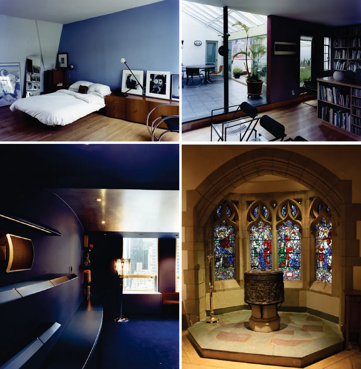
Le Corbusier was a modernist who used more than primary colors. He taught his architecture students to use colored pencils in their drawings that would break free from the traditional quagmires of the day. This example gives my clients a lesson to break out those very colored pencils, select hues; tint or shade, and make some marks getting started.
Color, light, form, texture and pattern are the essential aesthetic considerations for our design processes, in town or country. Nature doesn’t know limitations — rainbows know no boundaries.
What colors will work best for you?
building visions · Stuart Peaslee, Peaslee Architect, P.C.
© 2026 Peaslee Architect, P.C. All rights reserved. This material may not be published or re-used in any form without written permission.